Posts

The Shooting Star Candlestick Pattern
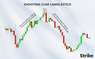
Image
 ### The Shooting Star Candlestick Pattern #### Description The Shooting Star is a bearish reversal candlestick pattern that typically appears at the top of an uptrend. It is characterized by a small real body near the lower end of the trading range, a long upper wick (shadow), and little or no lower wick. The long upper wick indicates that the market opened, rallied significantly, but then gave up most of the gains to close near the opening price. #### Characteristics - **Small Real Body**: Indicates minimal difference between the opening and closing prices. - **Long Upper Wick**: Reflects strong upward movement that was not sustained. - **Short or Absent Lower Wick**: Suggests limited lower price movement during the period. #### Significance The Shooting Star pattern signals that buyers initially drove prices higher, but sellers regained control, pushing prices back down. This shift in momentum from bullish to bearish suggests a potential reversal from an uptrend to a downtrend. ####

Understanding Candlestick Chart Patterns

Image
 ### Understanding Candlestick Chart Patterns: A Comprehensive Guide Candlestick charts are a popular tool used in trading to predict future price movements based on historical patterns. These charts are composed of individual "candles," each representing a specific time period and providing visual insight into the market's behavior. The body of the candle shows the opening and closing prices, while the wicks (or shadows) indicate the high and low prices within that period. Here's a comprehensive guide to the most common candlestick patterns, including both single-candle and multiple-candle formations. #### Single-Candle Patterns 1. **Doji**    - **Description**: A Doji occurs when the opening and closing prices are virtually the same, resulting in a very small body.    - **Significance**: Indicates indecision in the market; can signal a potential reversal when found at the top or bottom of trends. 2. **Hammer**    - **Description**: A short body with a long lower wic

How to Mastering the Hammer Candlestick Pattern

Image
 ### Mastering the Hammer Candlestick Pattern: A Comprehensive Guide for Traders The hammer candlestick pattern is a popular tool among traders for identifying potential reversals in the market. Recognizable by its distinct shape, the hammer is a single-candle formation that signals a possible bullish reversal after a downtrend. This guide will explore the hammer candlestick pattern, how to identify it, and strategies for effectively using it in your trading. #### What is a Hammer Candlestick Pattern? A hammer candlestick pattern forms at the bottom of a downtrend and is characterized by a small body with a long lower shadow. The key features of a hammer candlestick are: 1. **Small Real Body**: The distance between the open and close prices is small, indicating indecision among traders. 2. **Long Lower Shadow**: The lower shadow should be at least twice the length of the real body, showing that sellers pushed prices down during the session, but buyers regained control before the close.

How to use Fractal Choose Band Strategy easy way

Image
 ## Fractal Choose Band Strategy: A Comprehensive Guide ### Introduction The Fractal Choose Band Strategy is an advanced trading method combining fractal analysis with band indicators like Bollinger Bands or Keltner Channels. This strategy is particularly effective for identifying trend reversals and high-probability trade entries in various market conditions. ### Understanding Fractals Fractals are repetitive patterns that appear on all time frames and are used by traders to identify potential reversals in the market. A fractal consists of a series of five consecutive bars: - **Up Fractal**: The middle bar has the highest high, and the two bars on either side have lower highs. - **Down Fractal**: The middle bar has the lowest low, and the two bars on either side have higher lows. ### The Role of Bands Bands like Bollinger Bands or Keltner Channels are used to measure volatility and potential price levels where reversals or continuations might occur. - **Bollinger Bands**: Consist of a

How to Use the Fibonacci Indicator in Trading

Image
 ## How to Use the Fibonacci Indicator in Trading The Fibonacci indicator is a popular technical analysis tool used by traders to identify potential reversal levels and forecast price movements in financial markets. Based on the Fibonacci sequence, this tool helps traders determine support and resistance levels. Here’s a comprehensive guide on how to use the Fibonacci indicator effectively in your trading strategy. ### Understanding the Fibonacci Sequence The Fibonacci sequence is a series of numbers where each number is the sum of the two preceding ones, usually starting with 0 and 1. The sequence looks like this: 0, 1, 1, 2, 3, 5, 8, 13, 21, and so on. In trading, the key Fibonacci ratios are derived from this sequence, notably 23.6%, 38.2%, 50%, 61.8%, and 100%. ### Fibonacci Retracement Levels Fibonacci retracement levels are horizontal lines that indicate potential support and resistance levels. These levels are derived from the Fibonacci sequence and are used to predict the futur

how to use the MACD indicator

Image
 The Moving Average Convergence Divergence (MACD) is a popular technical analysis tool used in trading to identify potential buy and sell signals. Here's a basic guide on how to use the MACD indicator: 1. **Understanding MACD Components**:    - **MACD Line**: The difference between the 12-day and 26-day exponential moving averages (EMAs).    - **Signal Line**: A 9-day EMA of the MACD line.    - **Histogram**: The difference between the MACD line and the Signal line, displayed as bars. 2. **Setting Up the MACD**:    - Most trading platforms have the MACD indicator available. Typically, the default settings are (12, 26, 9). 3. **Interpreting MACD Signals**:    - **MACD Line Crosses Above Signal Line**: This is a bullish signal, suggesting it might be a good time to buy.    - **MACD Line Crosses Below Signal Line**: This is a bearish signal, suggesting it might be a good time to sell.    - **Histogram**: When the histogram is above the zero line, it indicates upward momentum. When it’

How to use RSI Indicator

Image
### How to Use the RSI Indicator The Relative Strength Index (RSI) is a popular momentum oscillator used by traders to evaluate the strength of a security's price movement and identify potential reversal points. Here's a step-by-step guide on how to effectively use the RSI indicator. #### 1. Setting Up the RSI Indicator 1. **Choose Your Trading Platform**: Most trading platforms like MetaTrader, TradingView, or broker-provided platforms offer the RSI indicator as a built-in tool. 2. **Add the RSI Indicator**: Locate the RSI in the list of technical indicators and add it to your chart. 3. **Set the Parameters**: The default setting for RSI is a 14-day period, but you can adjust this depending on your trading style. Shorter periods (e.g., 7 days) make RSI more sensitive, while longer periods (e.g., 21 days) make it smoother. #### 2. Interpreting RSI Readings 1. **Overbought and Oversold Levels**:    - **Overbought**: When RSI is above 70, it suggests that the asset may be overbou

Popular posts from this blog

The "Night channel" trading strategy

How to Use the Fibonacci Indicator in Trading

Technical indicators